Reduce, Recycle, Realign: The AC Transit App Sucks!
When you try transit, do you find the official apps frustrating? This article examines a San Francisco Bay Area transit app that leaves you guessing where your bus stop is.
[In case you missed Part 1 of this series, see Transit Agency Apps Suck!, about BART's official app.]
On August 10, 2025, the Alameda-Contra Costa County Transit District "realigned" its service. "Realign" is a euphemism for "reduce". It's also a euphemism for "recycle". California's third-largest bus transit agency redraws its route map every few years, often recycling ideas that didn't work before.
🚍 What is AC Transit Realign, really?
This supplement has been updated since August 4, 2025, when the main article was published.
Realign Uses Large Service Reductions to Fund Many Small Changes
AC Transit is significantly reducing bus service:
- on the San Pablo Avenue corridor in Oakland
- to the Oakland International Airport
- in Fremont
- between San Francisco and the East Bay (especially Richmond and Alameda)
The savings allow marginal changes elsewhere.
Too Little, Too Late: Realign Brings Public Transit to Brooklyn Basin
Brooklyn Basin along the Oakland Embarcadero is the only area receiving new bus service, thanks to the re-routing of Line 96, which runs daily, every 30 minutes. The City of Oakland approved 3,700 housing units. 1,500 housing units were finished by May, 2024. Asleep at the wheel, AC Transit failed to start service when people moved in. (A private shuttle runs to BART during weekday commute hours only.) A single public transit bus to BART every half hour would normally not be sufficient, but residents have been living for several years without transit, the development is single-use (housing, with a park and only a few restaurants), and the location is physically isolated.
Realign Recycles Past Ideas
Here are examples of recycling:
- Line 72R is returning to its former number, 72L. "Rapid bus" service was an operational failure (in practice, 72R buses were driven in pairs, leading to long gaps). Buses will once again run according to a fixed, predictable schedule.
- Line 21, itself renumbered from Line 50, is now being renumbered 31. Line 20, which overlaps, is being renumbered 30, though it's not changing in any way. This just causes confusion.
- Line 33 to Montclair and Line 18 to North Oakland, Berkeley, and Albany were split apart in March, 2017 under the "AC Go" plan, an earlier consultant-driven service makeover. Now they are being combined again.
- Service between Alameda and OAK was eliminated in the 2010s but restored within months. This time, AC Transit wants to eliminate it once and for all. The airport is right next to Alameda (Bay Farm Island).
- Service after midnight for logistics workers was removed in 1996, then restored, then enhanced, and is now being reduced (OAK, Line 73) or removed (Richmond, Line 376).
AC Transit Board Member Chris Peeples Dies Days Before Realign
AC Transit announced the death of a longtime board member in an August 8, 2025 press release, "Honoring the Memory of Board Director H.E. Christian Peeples". In a sad coincidence, I had written the following comment about the board just days before:
"These people drive to work. For them, getting on a train or bus is a photo opportunity, staged by a public relations team. There have been occasional exceptions, but the conscientious people have retired or are about to retire."
"Retired" was an allusion to Pat Piras (from long ago) and Elsa Ortiz (more recently). "About to retire" was an allusion to Chris Peeples. But his record requires more nuanced consideration.
When I sent the main article to AC Transit, I received no reply from management, but did receive a reply from a board member. That person is a transit rider.
The board member's record was unknown to me, so I read up. They had run into trouble with Michael Hursh, AC Transit's previous general manager, just for requesting a copy of a draft document about Realign! Chris Peeples (among others) sought to censure the board member for raising a question about Realign.
The board member was exonerated after an external investigation. It turns out that it is not a crime (so to speak) for a board member to ask a public agency staff member for a copy of a draft document. From my perspective, any member of the public could, by filing a public records request, access the same draft. Some public agency executives, like Mike Hursh, just don't like questions. Some board members, like Chris Peeples, are willing to play along.
I'll note that former board member Elsa Ortiz contacted agency staff on my behalf more than once. Elected officials should ask questions of staff! That is a far cry from interfering with the day-to-day operation of the agency. In Alameda, a former city council member did cross the line, creating a genuinely hostile climate for at least one competent and committed non-managerial city employee. You can tell the difference.
There is no question that Chris Peeples was a public transit supporter. Yet, Chris Peeples didn't fix or stop Realign, influence newer board members to do so, or help a board member who wanted to understand exactly what was going on with this ill-advised service change.
We will see, in the next few months, whether Realign attracts any new riders. Ridership levels don't matter anymore, of course. We've accepted that they will remain low. AC Transit's local bus network was allowed to become the transportation system of last resort two decades ago. A spirit of service innovation, which included initiatives like Line A between San Francisco, Downtown Oakland, and the Oakland International Airport; Line 99; and Line 376; was lost.
Ridership trends won't sway the board, but the number of complaints received by board members could compel the board to reverse Realign. Paradoxically, that would make the board seem sympathetic to riders' concerns.
The board might also choose a discreet approach, slipping changes into the regular quarterly "bid" process. Many of the little Realign service changes could be reversed without attracting attention, to fund restoration of:
- Line 376, the Richmond night-time transit-to-jobs bus
- Line 99, the no-nonsense (frequent, daily, all-day) bus connection between Union City and Fremont
- The link between Alameda and the neighboring Oakland International Airport (part of former Line 21)
- Half-hourly night service between the Oakland International Airport and East Oakland (Line 73's former service after midnight)
The San Pablo Avenue corridor in Oakland poses a tougher problem. Restoring the former level of service would be too expensive. It might be necessary to combine the different 72-series lines into one line, perhaps operating at a 20-minute frequency. An all-stops local line and a limited-stop line, each running at a 30-minute frequency, cannot provide consistent service on such a long and busy corridor.
Realign References and Conclusion
August 2025 Cost of Service Changes and Summary of Service Changes included in the August 2025 Sign-up from Staff Report 25-364 in the July 9, 2025 board meeting packet reveal how a few large cuts are being used to fund lots of inconsequential enhancements. In the right-most column of the first document, large reductions stand out. Where bus lines are being consolidated (e.g., Line 33 back to Line 18) or where service operates in a corridor (e.g., 72-series lines on San Pablo Avenue), add multiple values to calculate the net impact. For Fremont, add values for Line 99 and the 200-series lines.
AC Transit Realign is like a high-priced buffet that serves junk food.
Main article resumes...
A raft of service cuts, schedule changes, renumbered lines, combined lines, and split-up lines increases the importance of good information, but AC Transit's mobile app has missed the bus. This app makes me ashamed to be a software engineer, ashamed of the gap between:
- what the people who use software need,
- what the people who pay for software care about, and
- what the people who make software build.
This article exposes symptoms of a fundamentally broken yet remarkably common process for producing software. In later articles, I'll return to covering cures: ideas for building successful software.
AC Transit's Busiest Nodes: Oakland and San Francisco
You have to select a bus stop before you can see predicted departure times. The official AC Transit app makes it hard to find the busiest bus stops, so it fails usability testing from the start.
AC Transit's two busiest nodes are Downtown Oakland and the Salesforce Transit Center in Downtown San Francisco. Downtown Oakland is a transfer point comprising 20 on-street bus stops. The Salesforce Transit Center is a multi-level terminal station with a rooftop park, 37 bus deck bus bays, 5 ground-level bus bays, and several on-street stops for night buses. AC Transit uses 17 bays on the bus deck and 1 stop on the street.
A $2.4 Billion Bunch of Bus Stops in San Francisco
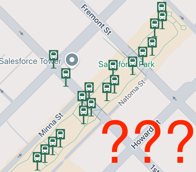
Here's what you see when you open the AC Transit app in Downtown San Francisco. You might wonder how to distinguish your bus stop from all the others. It beats me!
The only thing you can do is tap bus stops one-by-one until you chance upon yours.
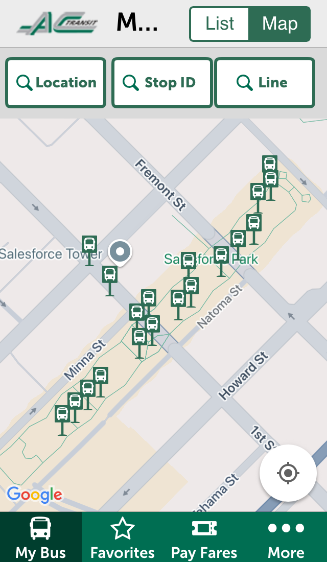
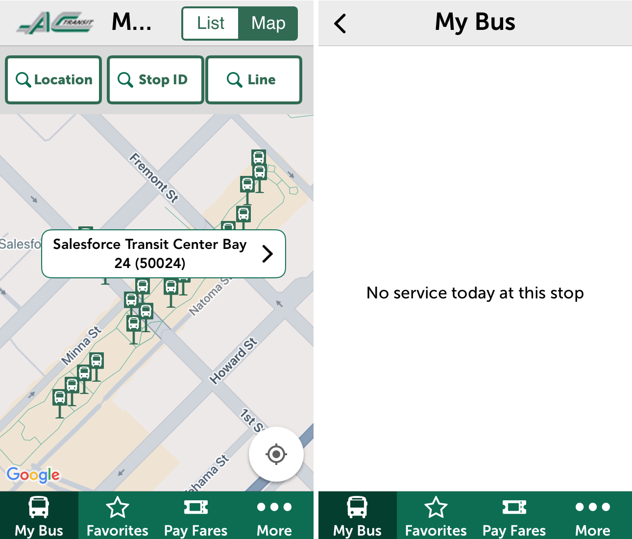
Don't try to pre-plan your commute the weekend before! (Most Transbay lines are weekday-only.) You can move the map to your destination, but when you access the app on weekends, most San Francisco stops just show:
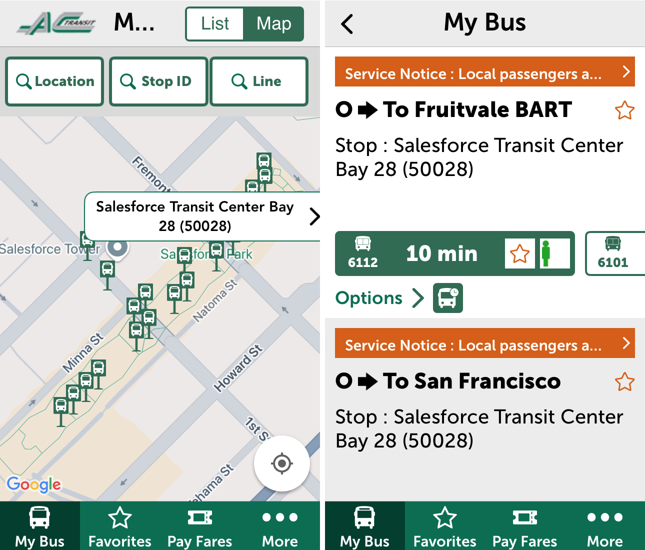
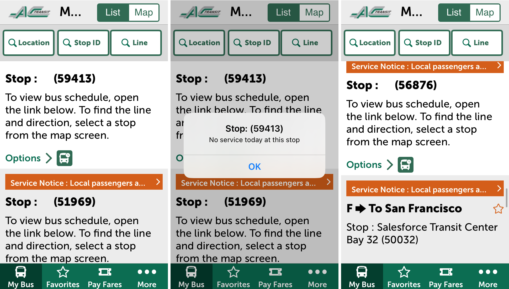
I tried switching from "Map" to "List". The many bus stops at the Salesforce Transit Center overwhelm the list view, which isn't sorted. At the time I checked, the list began with arbitrary, meaningless bus stop number 59413, followed inexplicably by the lower arbitrary, meaningless bus stop number 51969. If you scroll far enough, you might discern a pattern for the bays on the bus deck. Still, stop number 50018 (Bay 18) appeared before stop number 50012 (Bay 12). You have to scroll to find bus stops currently in-use. Wouldn't it make sense to list those first?
Search Feature Can't Find $2.4 Billion Transit Center
Settling in to a reclining, fabric-covered seat after a long day at work, as your Transbay bus departs for the East Bay, is a lot more comfortable than squeezing into a standing-room-only BART train, but can AC Transit's app beat BART's app in full-text search? The main screen of the AC Transit app offers three search options: Location, Stop ID, and Lines. (I'll ignore Stop IDs, the five-digit numbers mentioned above, because you won't know the Stop ID until you get there.)
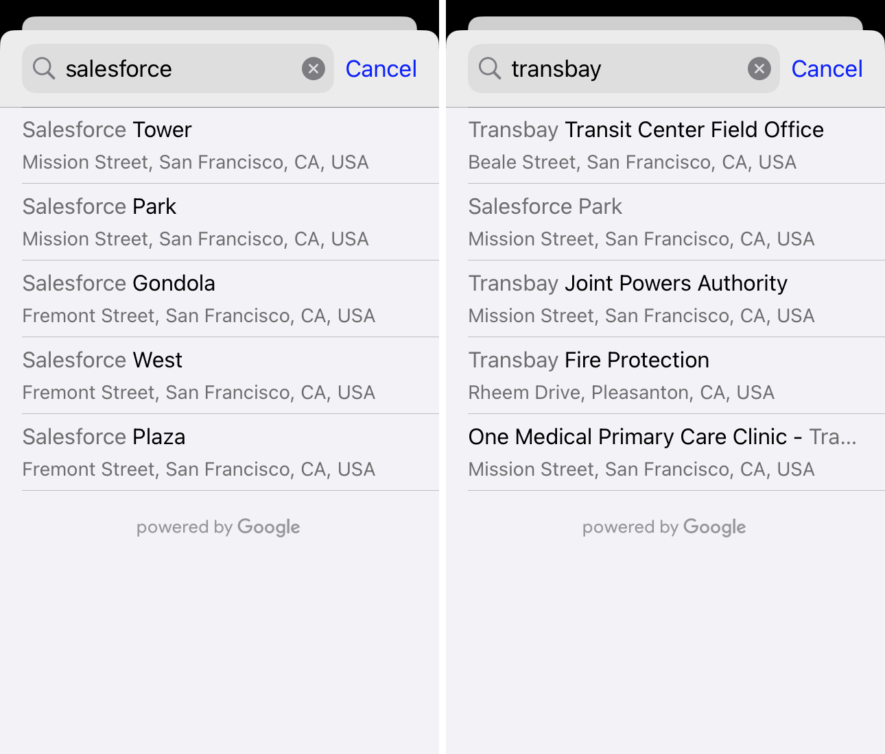
The likely location lookups, salesforce and transbay, return:
- nearby Salesforce office buildings,
- the tourist gondola that goes up to the rooftop park,
- nearby Transbay Joint Powers Authority offices, and
- a fire protection business in the suburbs,
but not the Transit Center itself.
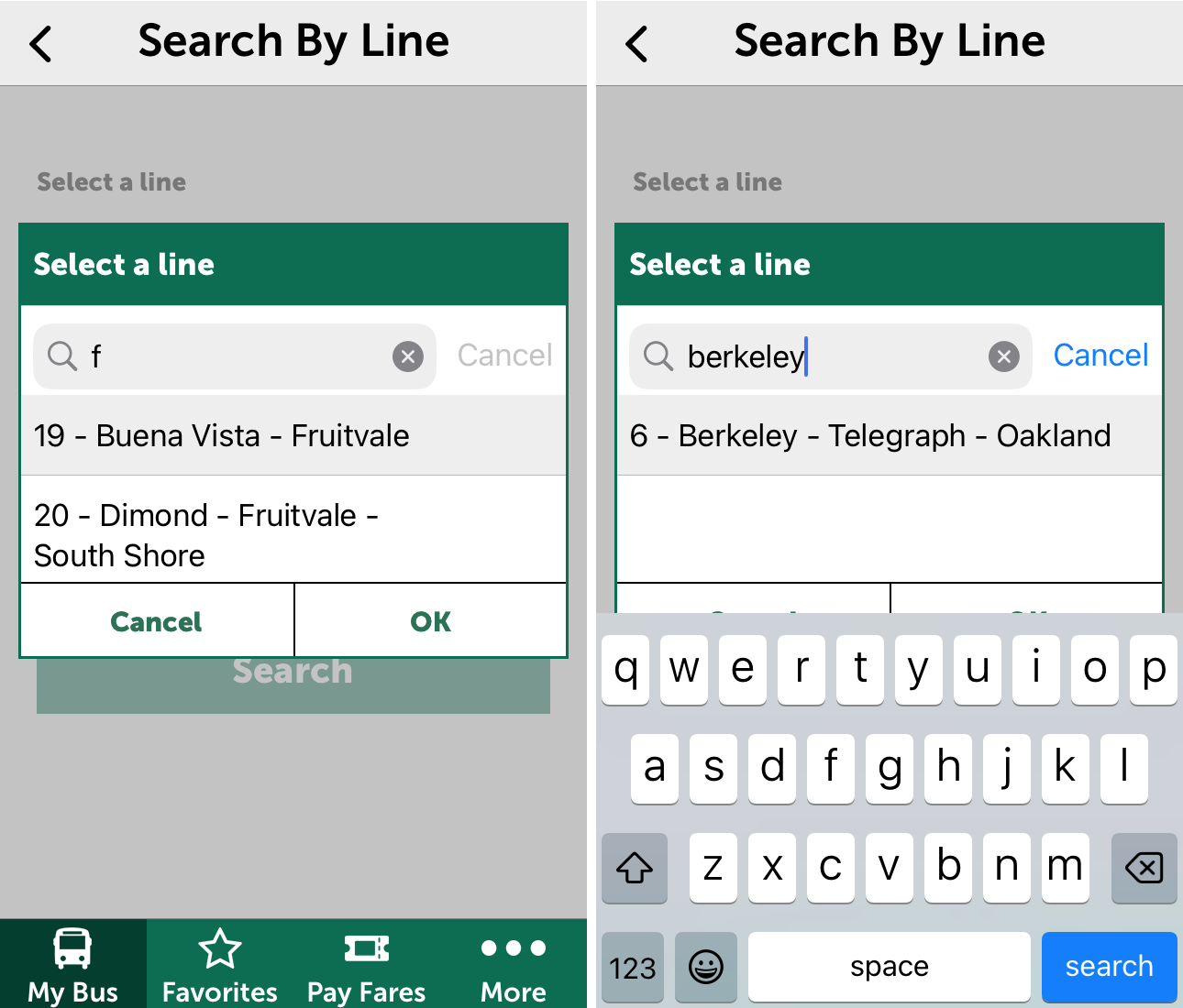
Searching by line opens a type-ahead widget. This one is a flop. Typing f for the popular Transbay bus line to Berkeley matches two non-Transbay lines that serve the Fruitvale neighborhood in Oakland. Typing berkeley matches only one line, and it's not Transbay. More than ten local and Transbay bus lines serve Berkeley, incidentally. You won't find them with this search widget!
"C" Is for Confusion
Apart from the problem of distinguishing bus stops in the official AC Transit app, there is the problem of distinguishing them in physical space. Bus deck bus bays have numbers, ground-level bus bays, letters, and on-street night bus stops, no user-friendly identifiers at all.
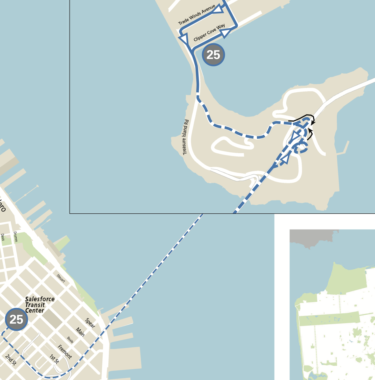
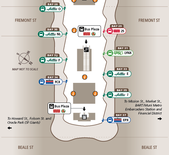
Most bus lines that use the bus deck have letters or names, but in taking over the T line from AC Transit, the San Francisco Municipal Railway assigned a number. The 25 Treasure Island bus stops at Bay 29. With one quarter of the bays on the bus deck unused due to service cuts, it would have been easy to allocate Bay 25. Muni's official route map doesn't help:
Returning to the map in the AC Transit app, I tried different magnification levels.
At a magnification level high enough to show three bays at a time (below, left side), some bus bay numbers appear. Bays 32 and 30 are not numbered, but Bay 28 is numbered in text 15 pixels tall. Cell phone screen pixel density is well over 300 pixels per inch, so the bus bay number is less than
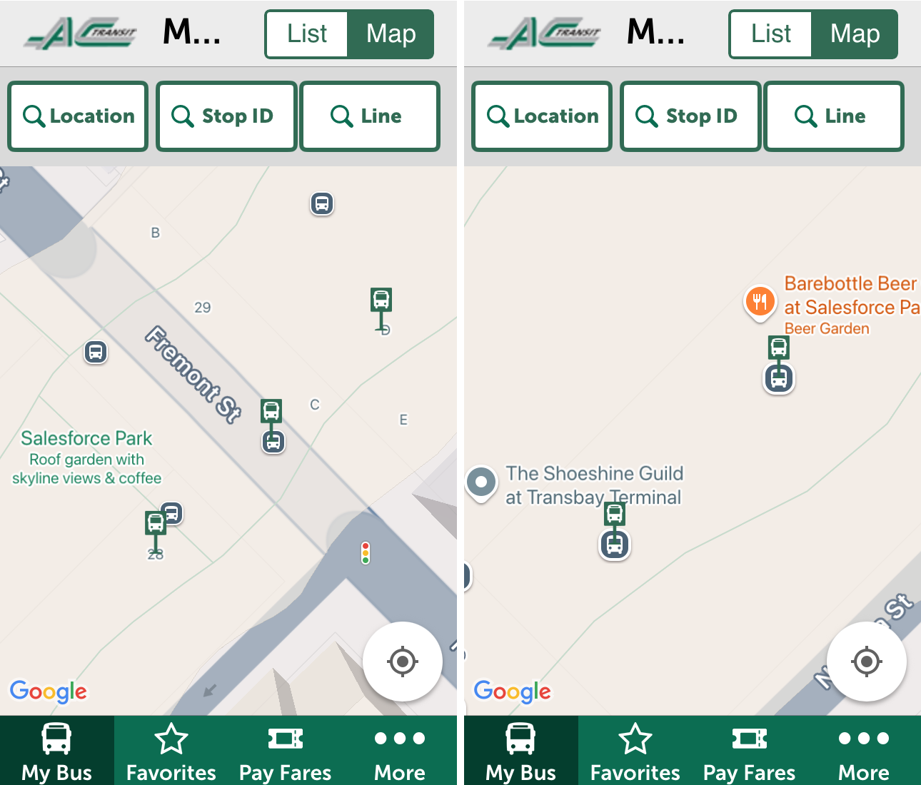
At a magnification level high enough to show only two bays (above, right side), bus bay numbers vanish again. As a consolation, the shoeshine booth and the beer garden appear. I don't think the shoeshine booth (ground level) ever reopened after the pandemic. The beer kiosk (rooftop) is open some evenings.
Does a Complete Station Map Exist?
I was curious whether someone planning a trip from, to or through the Salesforce Transit Center might find a map of all its bus stops on the Web.
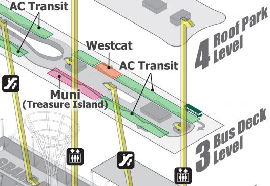
Muni's Salesforce Transit Center page lacks a bus stop map. The page features an outdated three-dimensional cutaway diagram without individual stops. Here's an excerpt:
Next, I turned to the agency that "manages" the building. You'll find Transbay Joint Powers Authority staff photos (it really does take a village: 4 chiefs, 6 directors, 6 managers and 1 supervisor oversee just 7 non-managerial employees) but you won't find any bus stop information on their Web site. The Transbay JPA's Transportation page has a blurry and badly-cropped but more recent version of the three-dimensional cutaway diagram, plus links to each transit agency's home page. The 23-person staff is too busy organizing Easter egg hunts, so go find your own bus stop map on someone else's Web site!
Embedded in a paragraph near the bottom of AC Transit's Transbay page is a link to a map of the bus deck only. Here's an excerpt:
There's nothing pertinent on AC Transit's Maps & Schedules page, which does not link to the completely separate Overview Maps page. If you happen to find AC Transit's Overview Maps page, nothing jumps out at first glance. At the bottom is a link to Transit Center Maps and Schedules.
If you haven't given up yet, AC Transit's Transit Center Maps and Schedules page lists BART train stations and other nodes in two columns, alphabetized by the first letter of the official station name. Naming inconsistencies and alphabetization make a bad combination, so you have to search within the page (Control-F or Command-F). Berkeley's stations, for example, are alphabetized not under "B" for Berkeley but under "A" for Ashby, "D" for Downtown Berkeley, and "N" for North Berkeley. The text San Francisco doesn't appear on the page, but in the right-hand column, two-thirds of the way down, is Salesforce Transit Center.
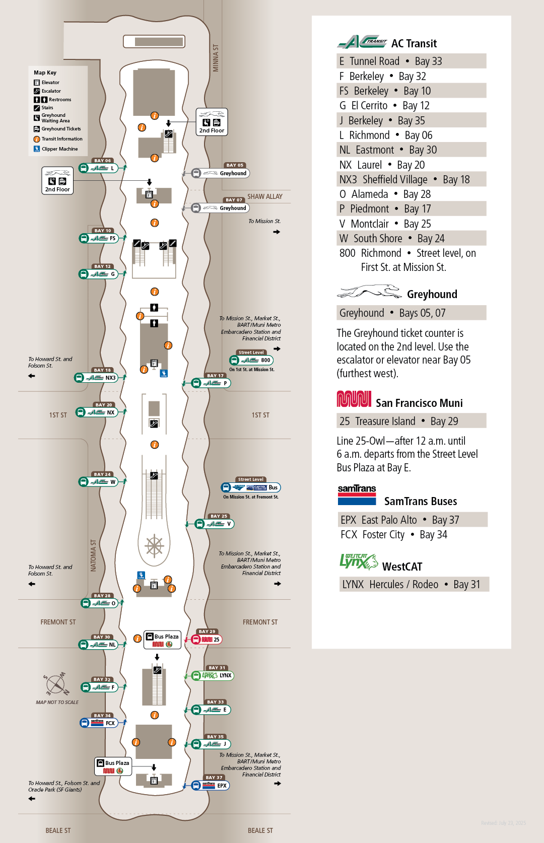
At last! Station Map (Bus Deck and Street Level) shows all bus stop assignments! This difficult-to-find map was a static PDF file generated in July, 2024. It could be out-of-date by the time you read this.
Downtown Oakland
If the official AC Transit app makes a mess of the Salesforce Transit Center, it does an even worse job presenting the system-wide transfer hub in Downtown Oakland. Alphabetized under "1" for 12th Street, the Oakland City Center map gives you a sense of the complexity of this conglomeration of 20 stops, arrayed along 5 blocks of Broadway and on 4 cross-streets.
Again, you're not likely to find the map on the Web. The map in the AC Transit app (below, left panel) lacks any labels to distinguish bus stops in Downtown Oakland.
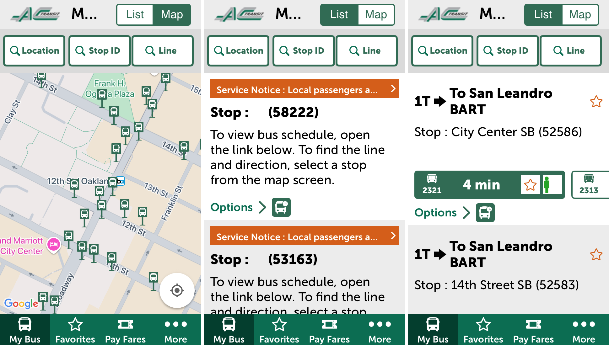
The list view once again begins with arbitrary, meaningless stop numbers (above, middle panel). If you scroll down and spot some in-use bus stops (above, right panel), just walk around until you resolve ambiguous names like "City Center SB" (City Center covers two entire city blocks) and "14th Street SB" (on Broadway at 14th Street, there are southbound stops on the north and south sides).
Maybe my critique seems silly. If you transfer habitually, you'll miss your connection the first time, but soon you'll remember where to wait. Habitual riders don't need transit apps for wayfinding. An app's wayfinding features should prioritize new riders. Now, imagine yourself walking with a cane, or carrying groceries, or traveling with a baby, and trying to negotiate this five-block transfer hub with so little information. AC Transit's official app fails all categories of riders.
Why You Should Care
BART and AC Transit wasted your money on mobile apps that don't work. The official apps as of July, 2025 don't help existing riders much and can't help new riders at all. Managers and resident software developers, or procurement staff and vendors, need to start performing usability testing. New riders won't try public transit without clear and complete information.
Third-party mapping and transit apps, with their national or international scope, might know even less about the exact locations of transit stops, how to walk there, and how to distinguish one from another. There is no substitute for local, up-to-date, agency-specific information.
Admittedly, I have fun shaming BART and AC Transit. It's easy to do because successive boards, management teams, and consultants have made a mess of capital projects, transit planning, and rider information. These people drive to work. For them, getting on a train or bus is a photo opportunity, staged by a public relations team. There have been occasional exceptions, but the conscientious people have retired or are about to retire. I'll take a moment to acknowledge bus operators, resident maintenance workers, and other rank-and-file people who keep us moving every day in spite of the leadership vacuum.
The public transit industry is like the software industry. In both fields, you can make much more money from selling expensive, complex projects that don't work, than from selling simple, effective solutions. Under the former approach, you get called back to fix the system, and you've made it so complex that only you can maintain it. Under the latter approach, the system works, and is simple enough that others can maintain it.
I would have more fun supporting and encouraging people who find innovative ways to help public transit riders. Since there's no hope for change within these agencies, who on the outside is willing to take up the challenge?
Feel free to leave a comment on the LinkedIn version of this article!